 Open access peer-reviewed chapter
Abstract
The SARS-CoV-2 pandemic spawned an abundance of open data originally collected by local public health agencies, then aggregated, enriched, and curated by higher-level jurisdictions as well as private corporations such as the news media. The COVID-19 datasets often contain geospatial references making them amenable to being presented cartographically as part of map-centered dashboards. Pandemic open data have been a blessing in that they enabled independent scientists and citizen researchers to verify official proclamations and published narratives related to COVID. In this chapter, however, we demonstrate that these data also are cursed with serious issues around variable definitions, data classification, and sampling methods. We illustrate how these issues interfere with unbiased public health insights and instead support narratives such as the “pandemic of the unvaccinated.” Nevertheless, open data can serve as a tool to counter dominant narratives and state-sanctioned misinformation. To advance this purpose, we need to demand disaggregated data with transparent metadata and multiple classification schemes.
Keywords
- COVID-19
- citizen research
- geospatial data
- misinformation
- narratives
- post-pandemic recovery
1. Introduction
Along with the SARS-CoV-2 pandemic, we experienced the emergence of a tremendous amount and variety of open data collected, shared, and used globally. However, upon closer inspection, many of the publicly available datasets are marred by data quality and semantic issues. This unique and still evolving situation motivated the critical analysis of COVID-19 open data presented in this chapter. Awareness of these issues is of critical importance for analysts and decision-makers to avoid repeating past mistakes in future public emergencies.
Open data and open content are defined by the Open Knowledge Foundation as those which “can be freely used, modified, and shared by anyone for any purpose” [1]. This includes data originating from government agencies, research institutions, and other organizations, including private-sector corporations as well as non-profits. The idea behind open data is to promote transparency, accountability, participation, and innovation in society by making it easier for individuals and groups to access and utilize data for various purposes. Open data are also supposed to facilitate communication and collaboration between citizens and governments [2].
Many organizations and initiatives are dedicated to promoting and implementing open data, such as the Open Data Institute, the World Bank, and the European Commission. Open data initiatives are becoming more common around the world. They are intended to support a wide range of applications such as journalism, civic technology, higher education, and scholarly research. These initiatives have the potential to create economic value by promoting innovation, efficiency, and competition. Using freely available open data, individuals and organizations can develop new products and services, improve existing ones, and make data-driven decisions. Yet, producing and consuming open data are not always trivial tasks: “Infomediaries, both human and nonhuman, negotiate the gap between open data providers and end-users, and can take the form of service providers, portals, and platforms” [3].
In a municipal context, it was found that some 80% of open datasets include geographic information [4]. These geospatial open data can be used for cartographic mapping and location-based analyses. Geospatial open data add value to economic development, urban and infrastructure planning, and a number of other areas of government activities with citizen involvement [5]. Gig economy companies like Uber and Airbnb have been able to leverage geospatial open data on transportation and housing, respectively, in order to create entirely new markets. Organizations and initiatives dedicated to promoting and implementing geospatial open data include OpenStreetMap Foundation, Open Source Geospatial Foundation, UN Open GIS Initiative, and US Geological Survey.
Medicine and public health are considered among the most promising applications of open data because of the potential of health information to improve patient outcomes and healthcare costs. Examples of open health data include clinical trial results, epidemiological data, healthcare system monitoring, and more. During the COVID-19 pandemic, open data in all of these areas of public health became almost ubiquitous in the media and social media. Most of the datasets include information about point locations or spatial units and can therefore be mapped and spatially analyzed. Numerous map-centered dashboards are a testament to this phenomenon [6, 7].
Nevertheless, open data in health also come with concerns related to privacy, security, and the ethical use of data. The widespread use of COVID data by professional and lay analysts has exposed serious issues with variable definitions, sampling, and categorization. In the following section, we review the past three years with respect to the most critical COVID data issues. Next, we briefly exemplify open data repositories and some of the best-known online applications using these data. In Section 4, we illustrate the impacts of open data issues on four recurring narratives of the pandemic. Lastly, we conclude the chapter with recommendations that could help ensure that open data are indeed a blessing in future crisis situations.
2. The pandemic data circus
The term “data circus” could be used to refer to a situation where large amounts of data are being collected, analyzed, and disseminated in an uncoordinated and chaotic manner, with little regard for quality or accuracy. During the COVID-19 pandemic, data have been employed to track the spread of the virus and understand its impact on communities, as well as to inform public health decisions and policies.
Open data of interest for this analysis can be grouped by interventions, outcomes, and contributing factors, and include the following:
Confirmed cases and deaths: These data include information on the number of confirmed cases and deaths from COVID-19, and are used to track the spread of the virus and the impact of public health interventions.
Testing and test positivity: These data include information on the number of tests being conducted and the percentage of tests that are positive, and are used to understand the spread of the virus and the effectiveness of testing strategies.
Health system capacity and usage: These data include information on the number of people who have been hospitalized and the number of people in ICU beds, and are used to understand the impact of the virus on the health system and the readiness of the health system to respond to the pandemic.
Vaccination rate and distribution: These data include information on the number of people who have been vaccinated and on the availability of vaccines, and are used to understand the progress of vaccination campaigns and the potential impact of vaccines on controlling the spread of the virus.
Safety and efficacy of non-pharmaceutical interventions and vaccines: These data include the timelines of interventions such as mask mandates, the SARS-CoV-2 epidemic curves, as well as the number and ratios of adverse event reports, and are used to understand the benefits and risks of these measures.
Socioeconomic and public health statistics: These data often originate from the Census of the respective populations and from other general-purpose sources such as geodemographics, tax databases, or public health monitoring.
A number of researchers have criticized the accuracy of COVID-related data or the way in which these data were interpreted for public health decision-making during the pandemic response. John Ioannidis is a professor of medicine and statistics at Stanford University, who is known for his research on the reliability of scientific studies. He has been critical of how COVID-19 data were reported and analyzed from the beginning of the pandemic, which he called “a fiasco in the making” [8]. He highlighted the age distribution and comorbidities of the fatalities in the early COVID-19 hotspots around the globe such as Northern Italy [9] and New York [10]. He also took it upon himself to create more accurate and reliable epidemic data in a case study for Santa Clara County, California [11]. His low estimates of the global infection-fatality rate for COVID, which were eventually published in the Bulletin of the World Health Organization (WHO) [12], were highly controversial. Ioannidis was also one of the first to explicitly warn of “the harms of exaggerated information and non-evidence-based measures” [13].
Prof. Carl Heneghan of the University of Oxford together with his colleagues at the Centre for Evidence-Based Medicine also published a series of critiques of public health practices that affected the COVID data, including the value of a positive PCR test [14] and definition of a COVID death [15]. Similar concerns were raised by another British research group around Prof. Norman Fenton of Queen Mary University. Fenton contributed to research on face mask efficacy [16] and the reliability of vaccine adverse event reports [17]. On their blog, Fenton and his colleague Prof. Martin Neil further explain the “Flawed Covid definitions, data and modelling” [18] that are pertinent to this chapter.
In Germany, a group around psychology professor Christof Kuhbandner at the University of Regensburg pointedly analyzed and commented on the impact of poor-quality data on the validity of policy decisions on pandemic response measures [19]. Similarly and more specifically, a team led by another psychologist, Prof. Oliver Hirsch of FOM University of Applied Sciences Siegen, found that mass testing yields unreliable data for COVID incidence calculations, which nevertheless were used for policy-making [20]. Even the mRNA vaccine trial data were not safe from criticism and review. For example, the British Medical Journal reported a whistle-blower’s concern about improper monitoring and follow-up on vaccine adverse events in the Pfizer trial [21], which could lead to embellished adverse event data.
Some of these researchers have been censored when their viewpoints diverged too far from the prevailing narrative; the tactics used by news media and big tech companies to suppress such dissenting opinions are outlined by Shir-Raz et al. [22]. Questions about the integrity of the scientific and scholarly publication process have emerged as well (e.g., [23]). On the upside, the widespread availability of COVID-19 data, and the ability to force the disclosure of additional datasets, allowed scholars, professional analysts, and private citizen researchers to verify/falsify claims made by public health agencies, pharma corporations, and established experts.
3. Select open data repositories and apps for COVID-19
Many COVID data trackers and repositories in the past three years were created to track the spread of the virus, the impact of the pandemic, and the effectiveness of interventions. Whether based on government and international organizations, research institutions, or the private sector (e.g., news media corporations), foundational data have been provided freely during the course of the pandemic with few strings attached. Most of the following repositories are wrapped in a graphical user interface that allows the user to explore select data before downloading them.
National and international government organizations offering COVID-related open data include the World Health Organization (WHO), US Centers for Disease Control and Prevention (CDC), and European Center for Disease Prevention and Control (ECDC), to name a few. The WHO’s global “Coronavirus (COVID-19) Dashboard” [24] presents key statistics on the COVID-19 pandemic, including cases and deaths as cumulative totals or rates per 100,000 population as well as recent cases and deaths, along with several vaccination-related variables, including doses administered, persons vaccinated in percent of total population, and vaccine brand(s) used in different countries. Unfortunately, the default view of the dashboard uses choropleth symbology, a cartographic technique that misrepresents raw-count data such as the cumulative COVID-19 cases shown (Figure 1). On a positive note, the WHO datasets can be accessed as comma-separated value (CSV) files in three clicks from the dashboard, with metadata on the field name, type, and description provided prior to download.
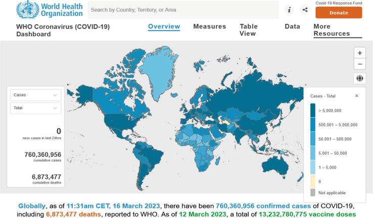
Figure 1.
Screenshot of WHO COVID-19 dashboard as of March 16, 2023. Note that the default view (choropleth map for raw-count data) conflicts with basic cartographic standards and the map is not properly projected. Source:
The ECDC’s “Latest COVID-19 Data” website [25] includes weekly (until October 2022: daily) and cumulative case and death counts, corresponding 14-day rates, as well as information on testing, SARS-CoV-2 variants in circulation, hospital and ICU admissions and occupancy, and vaccination. However, these data for European Union countries are copyrighted (not open). In contrast, the United States CDC’s “COVID Data Tracker” [26] presents a large variety of data, charts, and maps at the state or county levels. The available data include variables such as new weekly COVID-19 cases and deaths as well as hospital utilization; metrics such as community levels and community transmission; and related information such as the CDC’s Social Vulnerability Index. The corresponding data tables are extensively documented and can be downloaded in multiple data formats under the US government’s public domain license.
Examples of additional COVID-related government open data sites include other national sites such as that of the Public Health Agency of Canada [27], which includes wastewater surveillance information with downloadable “viral load” data; the UK’s Office for National Statistics [28] with an extensive collection of COVID-related content that is “available under the Open Government Licence v3.0, except where otherwise stated”; the COVID-19 landing page of the German infectious disease agency RKI [29] with categorized content on current epidemiology, vaccination, diagnostic testing, healthcare and therapy, long COVID, white papers and pandemic plans, research, and open data. Subnational sites such as that of Public Health Ontario often include more specialized data, for example, regional trends by public health unit, cases associated with long-term care home outbreaks, or neighborhood diversity and material deprivation [30]. The US Vaccine Adverse Event Reporting System [31] is another example of a separately collected, specialized dataset.
Numerous academic and private-sector websites serve as aggregators and curators of pandemic open data. Some of them have become better known than their original government data sources, including Worldometers’ COVID Live—Coronavirus Statistics [32], Our World in Data (OWID) [33], the COVID-19 Data Repository at the Center for Systems Science and Engineering (CSSE) at Johns Hopkins University [34, 35], The Atlantic’s COVID Tracking Project (discontinued March 7, 2021) [36], and Esri Canada’s COVID-19 Open Data hub [37].
Using the example of OWID, Figure 2 illustrates the central role of maps along with associated charts, data tables, and download options for the open datasets. The OWID site also provides an example of processed information, as it includes the Stringency Index from the Oxford Coronavirus Government Response Tracker (OxCGRT) [38]. That project uses open content on pandemic restrictions to model the stringency of national response measures in a single metric. Another example of an application based on processed data is the website “How Bad is My Batch,” [39] which uses the VAERS dataset to identify COVID-19 vaccine batch IDs with high rates of adverse events. It must be noted that data entry issues with the batch ID in VAERS may generate misleading toxicity information [40]. Lastly, the OpenVAERS site [41] presents “red-box summaries” (Figure 3a) and graphs of VAERS database queries (Figure 3b), including the frequency of annual death reports before and during the COVID-19 pandemic as well as the timing of reports in days after the injection.
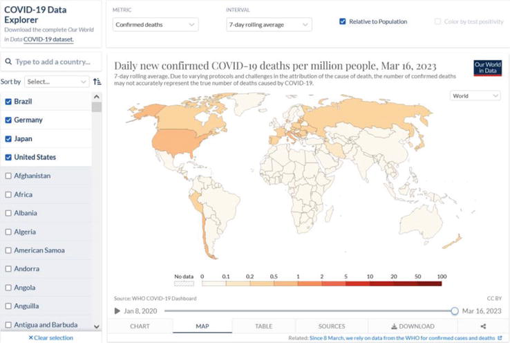
Figure 2.
Screenshot of Our World In Data, Coronavirus Pandemic (COVID-19) website as of March 21, 2023. Source:
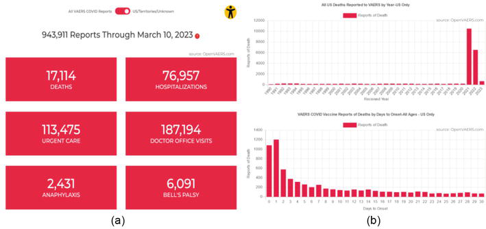
Figure 3.
Screenshot of OpenVAERS, a website providing moderated access to vaccine adverse event reports as of March 21, 2023. (a) Red-box summaries, and (b) charts of frequency and timing of death reports. Source:
Some COVID-related data have not been provided “voluntarily” but were obtained by community members using freedom-of-information (FOI) requests. The best-known example is a group called Public Health and Medical Professionals for Transparency (PHMPT), whose lawyer Aaron Siri obtained the release of Pfizer’s application documents from the US FDA through a court order [42]. In Australia, the Therapeutic Goods Authority maintains a log of FOI releases relating to drug safety dating back to July 2011 [43]. The documents provided are in PDF format, even though some of them include quantitative (tabular) data. The TGA has been criticized for providing only their answers, not the wording of the original requests, which would facilitate understanding the documents provided. As an example, COVID-related documents include the June 2021 release of the 928-page final report on Pfizer’s study RN9391R58, which includes some data tables relevant for vaccine safety in pregnant women. The same report, yet with fewer redactions, was released to PHMPT in November 2021.
4. Data-centered COVID-19 narratives and counter-narratives
During the COVID-19 pandemic, many different data-centered narratives emerged that relied on the availability of the near-real time and longer-term open data described in the previous section. The following examples illustrate the use of public health data to amplify fears of the virus in the general population; obfuscate healthcare system usage and overload; coerce people into accepting the COVID-19 vaccines; and mislead the public about the efficacy of face masks. In analogy with the infamous “pandemic of the unvaccinated,” we characterize the other narratives as the pandemics of the unafraid, the untreated, and the unmasked, respectively.
4.1 The pandemic of the unafraid
In early March 2023, internal messages by Matt Hancock, the UK’s Health Secretary at the beginning of the pandemic, were leaked to the Telegraph newspaper in what should be, by any pre-pandemic standards, a major political scandal. These “Lockdown Files” [44] demonstrate that the UK government deliberately sowed fear in order to secure the public’s compliance with pandemic restrictions. Hancock is quoted with WhatsApp messages dated December 13, 2020, discussing “When do we deploy the new variant” and planning to “frighten the pants of everyone with the new strain.” The UK along with many other governments appeared to worry that the population was not afraid enough and that a lack of compliance might lead to a “pandemic of the unafraid.”
This is perplexing since one of the fundamental rules in public health and outbreak response is to avoid the use of fear narratives [45]. Unfortunately, open data have also been abused to terrorize the population. With reference to epidemic curves of reported or modeled COVID-19 cases, politicians like Ontario’s Premier Doug Ford stoked the fear of a “terrible, terrible virus” [46].
The UK’s “Lockdown Files” warrant a reminder of the situation in December 2020. Archived BBC News web pages show the pandemic curve for the second wave of Covid deaths (based on the government data pictured in Figure 4) and an informative footnote stating that “Rules were amended over the summer to include deaths in the coronavirus total only if they occurred within 28 days of a positive test. Previously in England, all deaths after a positive test were included” [47]. Both, the before and after rules almost certainly led to an exaggeration of COVID mortality in public communications, and broader acceptance of the debate about “saving” or “canceling” Christmas 2020. The BBC headlines from the previous day included items like the following [48]:
Postcode check: Find out the rules where you live.
Christmas relief: In one city, the urge to meet is greatest of all.
How schools managed to save the Christmas nativity.
UK coronavirus cases up by 35,383 on Thursday.
Canceling Christmas: “They said they understood.”
“Miracle Covid survivor feared his life was over.”
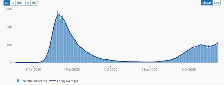
Figure 4.
United Kingdom—Deaths within 28 days of positive test by date of death up to December 19, 2020. Source:
Meanwhile, critical research had pointed out the misleading nature of the early 2020 COVID data, maps, charts, and infographics. For example, case counts depended on PCR tests, the use of which for diagnostic testing was critically flawed in several ways [49]. Resulting case counts as well as incidence rates were found to be unsuitable for decision-making [20]. Cartographic issues in online maps were also discussed by several research groups and geospatial industry representatives since February 2020 [6, 7, 50, 51]. Yet, up to the present time, organizations like OWID (Figure 2) suggest in the byline of their map and chart titles that the data on cases (wrongly equated with “infections”) and deaths due to COVID-19 may be undercounted, without intimating the possibility of the data being overcounted.
4.2 The pandemic of the untreated
While the pandemic of the unafraid reflects a broad-based fear narrative, a concomitant storyline emerged around the overload of hospital capacities early in the pandemic, for example, in the Lombardy region in Italy as well as New York City in the US. This “pandemic of the untreated,” or the concern that healthcare systems would be unable to treat everyone equally, was the basis for the initial “two weeks [of lockdown] to flatten the curve” and many subsequent waves of pandemic restrictions. Yet, it was never established that hospitals anywhere in the world were more overloaded during COVID-19 than during other respiratory disease cycles [e.g., [52]]. Intensive-care unit (ICU) capacity and occupancy in Ontario, Canada, hospitals fluctuated throughout the pandemic, as shown in an archived copy of the province’s hospitalization status as of February 1, 2022 [53]. There was significant availability (empty beds) at all times and non-COVID occupancy appears to have absorbed much of the episodic COVID-related peaks.
In addition, the impact of the virus itself came under scrutiny when we realized that hospitalizations due to COVID-19 were only a subset of all hospitalizations with a positive COVID-19 test. In January 2022, the Province of Ontario, Canada, added a variable to their hospitalization data to distinguish between COVID-19 as the cause of admission or intensive-care unit treatment on one hand, and COVID-19 as an incidental finding in a patient admitted and/or treated for another, often unrelated condition or injury, on the other hand. For example, the February 1, 2022 report [53] shows 44% “Admitted for other reasons.” The government open data charted in Figure 5 reveals that hospital admissions for other reasons accounted for around 60% of all “COVID-19 hospitalizations” since June 2022. Even among ICU admissions of the past year, between 30% and over 50% were assigned to the COVID-19 statistics although the virus was only an incidental finding. The Canadian media reported about the new variable [e.g., [54]], yet it took many journalists almost three years to acknowledge that “We are overcounting covid deaths and hospitalizations. That’s a problem” [55].
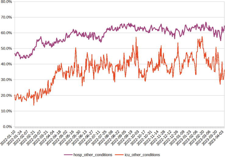
Figure 5.
Proportions of COVID-19 positive hospital and ICU admissions from January 2022 to early April 2023 that occurred for other reasons (not due to COVID). Data source: Ontario Data Catalog,
4.3 The pandemic of the unvaccinated
The slogan of the “pandemic of the unvaccinated” is attributed to CDC Director Dr. Rochelle Walensky’s press briefing on July 16, 2021 [56]. The statement was made with reference to higher proportions of seriously ill COVID patients among unvaccinated Americans than their proportion in the general or elderly populations would suggest. The original phrase referred to the threat to unvaccinated individuals’ own health, but it was quickly turned into a debate about the alleged threat posed by unvaccinated individuals and the ethics of prioritizing healthcare services for vaccinated patients [57, 58].
Do open data support the narrative of a pandemic of the unvaccinated? Using the example of the province of Ontario, Canada, during the summer and fall of 2021, the numbers and also the rates of unvaccinated individuals among cases, hospitalizations, and intensive-care unit patients were indeed higher than those of the vaccinated population. With reference to the case rates (Figure 6a), it must be noted that the mRNA vaccines were not designed to prevent infection and transmission [59]. Studies conducted during the first phases of rollout showed some reduction in transmission but the higher case rates among unvaccinated individuals in the second half of 2021 could as well be attributed to differences in testing frequency. Since this was a transition period during the implementation of the vaccine mandates, unvaccinated individuals such as post-secondary students and staff were required to present negative antigen tests to access campuses. With the Omicron variant and wave 5 starting in late 2021 [60], the case rate for vaccinated individuals (“immune escape,” “breakthrough” infections) crossed above the unvaccinated rate, and from February to June 2022, the two rates have been similar, while the rate for individuals with a booster dose was noticeably higher in spring 2022 (see Figure 6a).
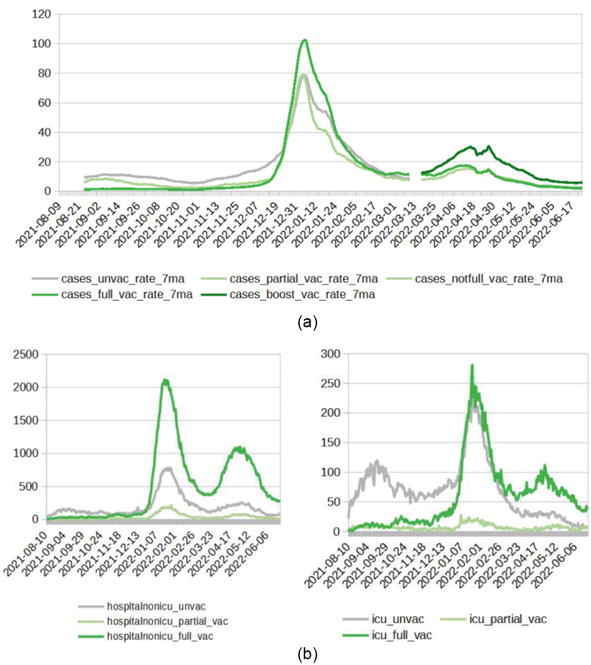
Figure 6.
(a) COVID-19 cases and (b) COVID-19 hospitalization and ICU occupancy rates by vaccination status, August 2021 to June 2022. Data source: Ontario Data Catalog,
The vaccines were developed to provide protection from symptomatic and severe COVID-19 [59]. This protection was later shown to wane in a span of a few months [61, 62]. Accordingly, the Public Health Ontario data on hospitalizations and ICU occupancy (Figure 6b) are higher in unvaccinated patients in 2021 but switch to a higher burden among vaccinated patients in 2022. These data are provided as counts only; rates are not available from this data source. In addition, the agency discontinued the publication of data on hospitalization by vaccination status as of June 30, 2022 with reference to the high fully vaccinated rate of “approximately 87% of eligible Ontarians” [63].
In the UK, independent researchers have highlighted discrepancies in the calculation of vaccination status due to the denominator for the unvaccinated rate [64]. Another example of issues with cross-referencing datasets on hospitalization and vaccination was highlighted in a comment responding to two US-based studies [65]. A newspaper reported in December 2021 in the context of Germany’s tightening lockdown rules that the incidence calculation for Bavaria included 57,489 cases with unknown vaccination status among 72,141 cases counted as unvaccinated [66]; that is, the unvaccinated rate may have been over-estimated almost fivefold due to data inconsistencies and misinterpretation.
4.4 The pandemic of the unmasked
To this day in March 2023, proponents of the COVID fear narratives are holding on to face masks as a tool for community protection. Meanwhile, a number of high-profile studies have shown limited to no evidence of efficacy from different types of face coverings, most recently the updated Cochrane systematic review on “Physical interventions to interrupt or reduce the spread of respiratory viruses” [67]. On the basis of results from multiple randomized-control trials before and during the SARS-CoV-2 pandemic, the authors conclude with moderate certainty that “Wearing masks in the community probably makes little or no difference to the outcome of influenza-like illness (ILI)/COVID-19 like illness compared to not wearing masks” nor to lab-confirmed infection. The confidence intervals for the risk ratios in both groups of trials include 1.0, meaning that there is a possibility that masks increased the risk of infection and/or illness rather than reduce it. In terms of types of face coverings, the review also could not confirm a difference in protection from N95/P2 respirators compared to medical/surgical masks, even in a healthcare setting.
Criticism in the news and social media focused on an overinterpretation of the Cochrane findings. For example, the Washington Post [68] writes “Yet another study on masking causes confusion.” Meanwhile their page title reads “The science has not changed. N95 masks still protect against covid,” in direct contradiction to the results of the study discussed. The writer in fact responds to misinterpretations of the Cochrane review rather than to the review’s findings. She laments that “Some have taken this to mean that masks don’t work to protect against the coronavirus,” while the review authors only concluded that there is no robust evidence that masks work.
What do the data tell us about community masking? Open data on voluntary masking or compliance with mask mandates are hard to come by, while metrics representing the stringency of government response measures such as the OxGRT index [38] confound masking with other non-pharmaceutical interventions. The most illuminating approach was popularized on social media by Ian Miller, a sports writer and science columnist, and author of “Unmasked: The Global Failure of COVID Mask Mandates” [69]. Miller plots daily or cumulative COVID-19 case rates of different jurisdictions against time and mask-related policies (Figure 7). Invariably, the data, which are taken from the WHO, show a respiratory disease cycle that is seemingly independent of public health interventions. While these charts can be viewed as oversimplified and will not replace substantial statistical analyses, they certainly inspire questions about the authoritarian nature of the Western pandemic response [70] and the safety of face masks [71]. Pandemic open data have repeatedly been misused by governments and media, for example, to conjure a “pandemic of the unmasked” during rising infections, in order to push for interventions without proper debate.
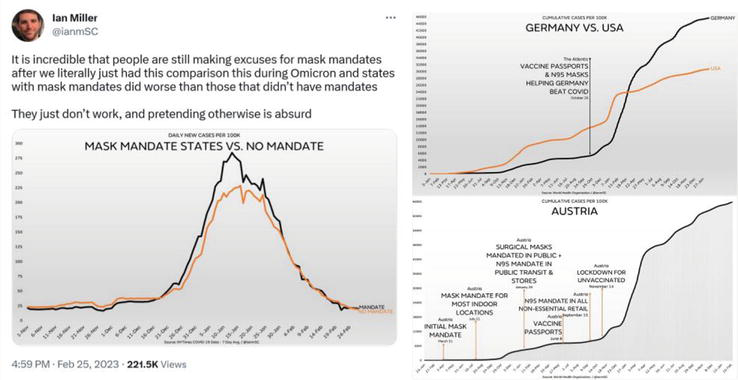
Figure 7.
Illustrations of the questionable impact of mask mandates on daily or cumulative COVID-19 case rates across countries and states. Source: Ian Miller Twitter account at
5. Conclusion: approaches toward reducing misinformation from, and with, open data
The hierarchical relationship between data, information, and knowledge is often visually represented in the form of a pyramid. At the base of the pyramid are the data: raw and unprocessed facts and figures that are collected across all fields of societal activity. As data are processed, organized, and analyzed, they are transformed into information, thereby becoming more meaningful and useful. As information in turn is understood, applied, and shared, it becomes knowledge, that is, the ability to use information to make decisions, solve problems, or gain insights. If errors are made when processing, organizing, and analyzing the underlying data, misinformation may result, which in turn can lead to wrong decisions. How can we prevent this from happening from, and with, pandemic open data?
It is desirable to have the most disaggregated open data available, subject to the limits of privacy regulations. In public health, individual case data will usually have to be aggregated but the approach used for aggregation is critical. For example, we have seen that vaccinated individuals were usually counted among unvaccinated cases until 14 days after receiving the shots. Instead, there should have been a separate group for those between days 0 and 14 after vaccination, allowing each analyst to decide how to aggregate them, if necessary. When analyzing vaccine efficacy, one might group these “not-yet-protected” with the unvaccinated. However, when analyzing vaccine safety, one would include these “just-vaccinated” with other vaccinated groups.
Equally desirable is transparent metadata. Defining anyone who passed away within 28 days of a positive test as a COVID-19 death is highly unexpected and requires proper labeling as in the above example from the BBC homepage [47]. Explanations from media or public health agencies of the chosen methodologies would go a long way in building trust with the public. For example, in response to a resident’s question, Toronto Public Health confirmed that “Individuals who have died with COVID-19, but not as a result of COVID-19 are included in the case counts for COVID-19 deaths in Toronto” [72]. This illustrates that the agencies did not hide their practices, but often failed to explain the reasons behind the skewed statistics and their implications.
Furthermore, survivor bias in comparisons between categories such as unvaccinated and vaccinated needs to be addressed. Due to the one-directional movement of individuals from one category to the other (but never back), the time spent in the first category must be taken into account by using person-time as a unit rather than simple person-count [73].
When public health agencies and many academic scientists are captured, we depend on investigative journalists and citizen researchers to challenge state-controlled narratives. Instead, “many historic norms of journalism were ditched in newsrooms around the world” [74], norms regarding critical unbiased investigations and speaking truth to power. Additionally, “laypersons” were told by the media, “You Must Not ‘Do Your Own Research’ When It Comes To Science” [75]. In such an environment of one-sided reporting and lack of a diversity of allowable opinions, open data become an essential resource for a growing and striving citizen research ecosystem. The openness of COVID-19 data, therefore, was a blessing, if in disguise.
Acknowledgments
This research was partially funded through a grant from the Natural Sciences and Engineering Research Council of Canada.
References
- 1.
Open Knowledge Foundation. The Open Definition, Available from: http://opendefinition.org/ - 2.
Open Data Charter. Principles. Available from: https://opendatacharter.net/principles/ - 3.
Fast V, Rinner C. Mediating open data: Providers, portals, and platforms. Editorial, Journal of the Urban and Regional Information Systems Association. 2017; 28 (1):7-8 - 4.
Baculi E, Fast V, Rinner C. The geospatial contents of municipal and regional open data catalogs in Canada. Journal of the Urban and Regional Information Systems Association. 2017; 28 (1):39-48 - 5.
Greene S, Rinner C. Examining the value of geospatial open data. In: Robinson PJ, Scassa T, editors. The Future of Open Data. Ottawa, ON: University of Ottawa Press. pp. 159-178 - 6.
Mooney P, Juhász L. Mapping COVID-19: How web-based maps contribute to the infodemic. Dialogues in Human Geography. 2020; 10 (2):265-270 - 7.
Rinner C. Mapping COVID-19 in context: Promoting a proportionate perspective on the pandemic. Cartographica. 2021; 56 :14-26 - 8.
Ioannidis JPA. A Fiasco in the Making? As the Coronavirus Pandemic Takes Hold, We Are Making Decisions Without Reliable Data. Boston, MA: Stat News; 2020. Available from: https://www.statnews.com/2020/03/17/a-fiasco-in-the-making-as-the-coronavirus-pandemic-takes-hold-we-are-making-decisions-without-reliable-data/ - 9.
Boccia S, Ricciardi W, Ioannidis JPA. What other countries can learn from Italy during the COVID-19 pandemic. JAMA Internal Medicine. 2020; 180 :927-928 - 10.
Chin V, Samia NI, Marchant R, Rosen O, Ioannidis JPA, Tanner MA, et al. A case study in model failure? COVID-19 daily deaths and ICU bed utilisation predictions in New York state. Journal European Journal of Epidemiology. 2020; 35 :733-742 - 11.
Bendavid E, Mulaney B, Sood N, Shah S, Bromley-Dulfano R, Lai C, et al. Covid-19 antibody seroprevalence in Santa Clara county, California. International Journal of Epidemiology. 2021; 50 :410-419 - 12.
Ioannidis JPA. Infection fatality rate of COVID-19 inferred from seroprevalence data. Bulletin of the World Health Organization. 2021; 99 :19-33F - 13.
Ioannidis JPA. Coronavirus disease 2019: The harms of exaggerated information and non-evidence-based measures. European Journal of Clinical Investigation. 2020; 50 (4):e13222 - 14.
Jefferson T, Heneghan C, Spencer E, Brassey J. Are You Infectious if you have a Positive PCR Test Result for COVID-19. Oxford, UK: Centre for Evidence-Based Medicine, University of Oxford; 2020. Available from: https://www.cebm.net/covid-19/infectious-positive-pcr-test-result-covid-19/ - 15.
Heneghan C, Oke J. Public Health England has Changed its Definition of Deaths: Here’s what it Means. Oxford, UK: Centre for Evidence-Based Medicine, University of Oxford; 2020. Available from: https://www.cebm.net/covid-19/public-health-england-death-data-revised/ - 16.
Fenton NE. The Bangladesh Mask Study: A Bayesian Perspective. Preprint. 2022. Available from: https://www.researchgate.net/publication/360320982 - 17.
McLachlan S, Osman M, Dube K, Chiketero P, Choi Y, Fenton N. Analysis of COVID-19 Vaccine Death Reports from the Vaccine Adverse Events Reporting System (VAERS) Database. Preprint. 2021. Available from: https://www.researchgate.net/publication/352837543 - 18.
Fenton N, Neil M. Flawed Covid definitions, data and modelling. Blog post, “Where are the numbers?” on Substack. 2022. Available from: https://wherearethenumbers.substack.com/p/flawed-covid-definitions-data-and - 19.
Kuhbandner C, Homburg S, Walach H, Hockertz S. Was Germany’s Lockdown in Spring 2020 necessary? How bad data quality can turn a simulation into a delusion that shapes the future. Futures. 2022; 135 :102879 - 20.
Hirsch O, Bergholz W, Kisielinski K, Giboni P, Sönnichsen A. Methodological problems of SARS-CoV-2 rapid point-of-care tests when used in mass testing. AIMS Public Health. 2022; 9 (1):73-93 - 21.
Thacker PD. Covid-19: Researcher blows the whistle on data integrity issues in Pfizer’s vaccine trial. British Medical Journal. 2021; 375 :n2635 - 22.
Shir-Raz Y, Elisha E, Martin B, Ronel N, Guetzkow J. Censorship and suppression of Covid-19 Heterodoxy: Tactics and counter-tactics. Minerva. 2022. DOI: 10.1007/s11024-022-09479-4 [Published online ahead of print] - 23.
Ioannidis JPA. How the Pandemic is Changing the Norms of Science. Tablet Magazine. 2021. Available from: https://www.tabletmag.com/sections/science/articles/pandemic-science - 24.
World Health Organization. WHO Coronavirus (COVID-19) Dashboard, Available from: https://covid19.who.int/ - 25.
European Centre for Disease Prevention and Control. Latest COVID-19 Data. Available from: https://www.ecdc.europa.eu/en/covid-19/data - 26.
Centers for Disease Control and Prevention. COVID Data Tracker. Atlanta, GA: US Department of Health and Human Services, CDC; 2023 Available from: https://covid.cdc.gov/covid-data-tracker - 27.
Public Health Agency of Canada. Coronavirus Disease (COVID-19). Available from: https://www.canada.ca/en/public-health/services/diseases/coronavirus-disease-covid-19.html - 28.
Office for National Statistics. Coronavirus (COVID-19). Available from: https://www.ons.gov.uk/peoplepopulationandcommunity/healthandsocialcare/conditionsanddiseases - 29.
Robert Koch-Institut. Coronavirus SARS-CoV-2. Available from: https://www.rki.de/DE/Content/InfAZ/N/Neuartiges_Coronavirus/nCoV_node.html - 30.
Public Health Ontario. COVID-19 in Ontario: Focus on May 22, 2022 to May 28, 2022. Weekly Epidemiological Summary (Archived). Available from: https://www.publichealthontario.ca/-/media/Documents/nCoV/epi/2022/05/covid-19-weekly-epi-summary-report-may-28.pdf - 31.
Centers for Disease Control and Prevention. Vaccine Safety, Vaccine Adverse Event Reporting System (VAERS). Available from: https://www.cdc.gov/vaccinesafety/ensuringsafety/monitoring/vaers/index.html - 32.
Worldometer. COVID – Coronavirus Statistics. Available from: https://www.worldometers.info/coronavirus/ - 33.
Mathieu E, Ritchie H, Rodés-Guirao L, Appel C, Giattino C, Hasell J, Macdonald B, Dattani S, Beltekian D, Ortiz-Ospina E, Roser M. Coronavirus Pandemic (COVID-19). 2020. Available from: OurWorldInData.org, https://ourworldindata.org/coronavirus - 34.
Center for Systems Science and Engineering. COVID-19 Dashboard. Baltimore, MD: Johns Hopkins University. Available from: https://coronavirus.jhu.edu/map.html - 35.
Dong E, Du H, Gardner L. An interactive web-based dashboard to track COVID-19 in real time. The Lancet Infectious Diseases. 2020; 20 (5):533-534. DOI: 10.1016/S1473-3099(20)30120-1 - 36.
The COVID Tracking Project. The Atlantic. Available from: https://covidtracking.com/ - 37.
Esri Canada Inc. COVID-19 Canada, COVID-19 Resources. Available from: https://resources-covid19canada.hub.arcgis.com/ - 38.
Hale T, Angrist N, Goldszmidt R, Kira B, Petherick A, Phillips T, et al. A global panel database of pandemic policies (Oxford COVID-19 Government Response Tracker). Nature Human Behaviour. 2021; 5 (4):529-538. DOI: 10.1038/s41562-021-01079-8 - 39.
How Bad is My Batch. Available from: https://howbadismybatch.com/ - 40.
Ontario Civil Liberties Association. OCLA Statement on Analysis of Batch-Specific Toxicity of COVID-19 Vaccine Products using VAERS Data. Available from: https://ocla.ca/ocla-statement-on-analysis-of-batch-specific-toxicity-of-covid-19-vaccine-products-using-vaers-data/ - 41.
OpenVAERS. VAERS COVID Vaccine Adverse Event Reports. Available from: https://openvaers.com/covid-data - 42.
Public Health and Medical Professionals for Transparency. Pfizer’s Documents. Online Document Archive. Available from: https://phmpt.org/pfizers-documents/ - 43.
Therapeutic Goods Auhority. FOI disclosure log. Online Document Archive. Available from: https://www.tga.gov.au/foi-disclosure-log - 44.
The Telegraph. The Lockdown Files. Investigative Report. Available from: https://www.telegraph.co.uk/news/lockdown-files/ - 45.
Stolow JA, Moses LM, Lederer AM, Carter R. How fear appeal approaches in COVID-19 health communication may be harming the global community. Health Education & Behavior. 2020; 47 (4):531-535 - 46.
CTV News. Ontario Economy to Reopen 'in a Trickle' Premier Says, After Suggesting Some Relaxation by Victoria Day. 2020. Available from: https://ottawa.ctvnews.ca/ontario-economy-to-reopen-in-a-trickle-premier-says-after-suggesting-some-relaxation-by-victoria-day-1.4906840 - 47.
BBC News. 2020. Available from: https://web.archive.org/web/20201219034027/https://www.bbc.com/news/uk-51768274 - 48.
BBC News. 2020. Available from: https://web.archive.org/web/20201218100523/https://www.bbc.com/news/coronavirus - 49.
Tang Y-W, Schmitz JE, Persing DH, Stratton CW. Laboratory diagnosis of COVID-19: Current issues and challenges. Journal of Clinical Microbiology. 2020; 58 (6):e00512-e00520 - 50.
Field K. Mapping Coronavirus, Responsibly. Blog Post. 2020. Available from: https://www.esri.com/arcgis-blog/products/product/mapping/mapping-coronavirus-responsibly/ - 51.
Juergens C. Trustworthy COVID-19 mapping: Geo-spatial data literacy aspects of choropleth maps. KN - Journal of Cartography and Geographic Information. 2020; 70 :155-161 - 52.
National Health Service (NHS) in England. Bed Availability and Occupancy – Overnight. Available from: https://www.england.nhs.uk/statistics/statistical-work-areas/bed-availability-and-occupancy/bed-data-overnight/ - 53.
Government of Ontario. Hospitalizations | COVID-19 (coronavirus) in Ontario. 2022. Available from: https://web.archive.org/web/20220201215018/https://covid-19.ontario.ca/data/hospitalizations - 54.
Global News. 46% of those currently hospitalized with COVID in Ontario were admitted for other reasons: New data. By Ryan Rocca. 2022. Available from: https://globalnews.ca/news/8502714/ontario-incidental-covid-hospitalizations-january-11/ - 55.
Washington Post. We are Overcounting Covid Deaths and Hospitalizations. That’s a Problem. By Leana S. Wen, Contributing columnist. 2023. Available from: https://www.washingtonpost.com/opinions/2023/01/13/covid-pandemic-deaths-hospitalizations-overcounting/ - 56.
The New York Times. C.D.C. Director Warns of a ‘Pandemic of the Unvaccinated’. By Emily Anthes and Alexandra E. Petri. 2021. Available from: https://www.nytimes.com/2021/07/16/health/covid-delta-cdc-walensky.html - 57.
Goldman E. How the unvaccinated threaten the vaccinated for COVID-19: A Darwinian perspective. Proceedings of the National Academy of Sciences of the United States of America. 2021; 118 (39):e2114279118 - 58.
Kampf G. COVID-19: Stigmatising the unvaccinated is not justified. The Lancet. 2021; 398 (10314):1871 - 59.
Doshi P. Will covid-19 vaccines save lives? Current trials aren’t designed to tell us. BMJ. 2020; 371 :m4037 - 60.
Public Health Agency of Canada. Federal, Provincial, Territorial Public Health Response Plan for Ongoing Management of COVID-19, 3rd edition. Available from: https://www.canada.ca/en/public-health/services/diseases/2019-novel-coronavirus-infection/guidance-documents/federal-provincial-territorial-public-health-response-plan-ongoing-management-covid-19.html - 61.
Tartof SY et al. Effectiveness of mRNA BNT162b2 COVID-19 vaccine up to 6 months in a large integrated health system in the USA: A retrospective cohort study. The Lancet. 2021; 398 (10309):1407-1416 - 62.
Ferdinands JM et al. Waning of vaccine effectiveness against moderate and severe covid-19 among adults in the US from the VISION network: test negative, case-control study. BMJ. 2022; 379 :e072141 - 63.
Government of Ontario. Data Catalogue, Hospitalizations by Vaccination Status. Available from: https://data2.ontario.ca/en/dataset/covid-19-vaccine-data-in-ontario/resource/274b819c-5d69-4539-a4db-f2950794138c - 64.
Neil M, Fenton N, Smalley J, Craig C, Guetzkow J, McLachlan S, Rose J. Official Mortality Data for England Suggest Systematic Miscategorisation of Vaccine Status and Uncertain Effectiveness of Covid-19 Vaccination. 2022. Available from: https://www.researchgate.net/profile/Martin-Neil-2/publication/357778435 - 65.
Yim P. Concerns about COVID-19 vaccination observational trials in the United States. JAMA Internal Medicine. 2022; 182 (10):1071-1081. Available from:https://jamanetwork.com/journals/jamainternalmedicine/fullarticle/2796235 - 66.
Berliner Zeitung. Verzerrung der Statistik? Bayern zählt unbekannten Impfstatus als ungeimpft. [Skewed statistics? Bavaria counts unknown vaccination status as unvaccinated.]. 2021. Available from: https://www.berliner-zeitung.de/news/verzerrung-der-statistik-bayern-zaehlt-unbekannten-impfstatus-als-ungeimpft-li.199206 - 67.
Jefferson T et al. Physical Interventions to Interrupt or Reduce the Spread of Respiratory Viruses. Cochrane Database of Systematic Reviews. 2023. Available from: https://www.cochranelibrary.com/cdsr/doi/10.1002/14651858.CD006207.pub6/full - 68.
Washington Post. Yet Another Study on Masking Causes Confusion. By Leana S. Wen, Contributing Columnist. 2023. Available from: https://www.washingtonpost.com/opinions/2023/02/16/cochrane-study-masks-covid-pandemic/ - 69.
Miller I. Unmasked: The Global Failure of COVID Mask Mandates. Brentwood, TN: Post Hill Press. p. 232 - 70.
Simandan D, Rinner C, Capurri V. The academic left, human geography, and the rise of authoritarianism during the COVID-19 pandemic. Geografiska Annaler B. Human Geography. Published online: 23 January 2023. DOI: 10.1080/04353684.2023.2168560 - 71.
Kisielinski K, Giboni P, Prescher A, Klosterhalfen B, Graessel D, Funken S, et al. Is a mask that covers the mouth and nose free from undesirable side effects in everyday use and free of potential hazards? International Journal of Environmental Research and Public Health. 2021; 18 (8):4344 - 72.
Toronto Public Health. Individuals Who Have Died With COVID-19, but Not as a Result of COVID-19 are Included in the Case Counts for COVID-19 Deaths in Toronto. Tweet. 2020. Available from: https://twitter.com/TOPublicHealth/status/1275888390060285967 - 73.
Fenton N. 'Never Vaccinated' vs 'Ever Vaccinated' Mortality Rate Illusion. Blog Post. 2023. Available from: https://wherearethenumbers.substack.com/p/never-vaccinated-vs-ever-vaccinated - 74.
Trish Wood. CBC Journalist Quits over Biased COVID Coverage and I Get Cancelled (Temporarily) for Telling Her Story. Blog Post and Podcast. 2022. Available from: https://trishwood.substack.com/p/cbc-journalist-quits-over-biased - 75.
Forbes. You Must Not ‘do Your Own Research’ When it Comes to Science. By Ethan Siegel. 2020. Available from: https://www.forbes.com/sites/startswithabang/2020/07/30/you-must-not-do-your-own-research-when-it-comes-to-science/